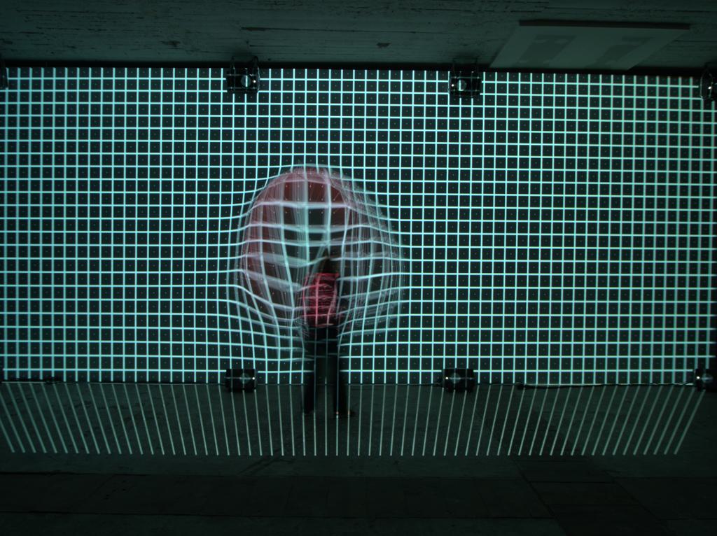
Another aspect of the lens/sensor combination. What happens if you screw good lenses onto low-resolution sensors or bad lenses onto high-resolution sensors? What effect does this have on the data quality?

Here we have a sensor that has a much higher resolution than the lens. Dots are displayed blurred.

The image is now rotated twice by 17° to the left, then twice by 17° to the right. The saturation decreases slightly, but the image does not deteriorate significantly. Due to the higher resolution, the image is comparatively resistant to subsequent manipulation.

Here we have a low-resolution sensor and an extremely sharp lens. The actual “dot” becomes a digital “cross”.

Same treatment of this point: The picture has deteriorated enormously. The points, which are actually far apart, are already overlapping and the image becomes muddy.
So that’s the number graphically. This problem of poor data quality is particularly significant when digitising slides. You scan at a phenomenal 9600 dpi and only get data for 2400 dpi. A lot helps a lot. To show you what this looks like:
XXVXXXOXXXGXXXEXXXLX
Here we have 75% data rubbish and 25% useful data. What is the word? And now we replace the X with letters that are in the alphabet around the payload letter, i.e. not “white pixels” but similarly coloured pixels
TUVWMNOPEFGHCDEFJKLM
Filtering out the user data is quite a challenge.
And now we sharpen. Sharpness means edge contrast. This means that I increase the contrast at colour transitions. Unfortunately, you can’t put the sharpness between the user data; instead, the sharpness overwrites the user data. It then looks like this;
AUVAANOAZFGZZDEZZKLZ
Everything beyond the N gets an A as contrast, everything before gets a “Z”. Lo and behold, the “VOGEL” is much easier to recognise. But if we sharpen the “VOGEL”, it looks like this: “AOAZLZ”.
Surprise: Images with poor data quality are much easier to post-process than images that are already perfect out of the camera. They can be rotated and sharpened more easily because a lot of the image manipulation affects the data rubbish. Poor images can therefore be improved within limits through image manipulation – but they will never be as good as images that have high data quality right from the start. However, the better the images are out of the box, the worse they become through manipulation.
The famous “image quality” parameter that is currently being hyped so much – this is where it originated. Unfortunately, there is so much tampering with the images in the camera these days that the actual image quality that comes out of the camera is only in the YVDFOGKGHDEFHLK range for many sensor/lens combinations. CAs are removed, diffractions calculated out and lens distortions corrected. And, of course, sharpened until the doctor comes.
High-resolution sensors on cheap glass or 5MP on repro glass? If you fancy spicing up lousy images with image processing: The former. If you take photos so that you’re done after the shutter release – the latter.
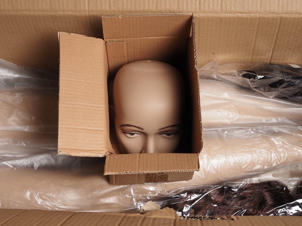
Incidentally, Excire picked out the pictures for me on the subject of “headroom”. Headroom is the space around the signal that can be manipulated without destroying the original signal.
Schön, dass ich den größeren Teil meiner Fotografie nach dem Auslösen als “fertig” ansehe. Da komme ich dann mit den 16MPix der 1. E-M1 an den “ollen” FT TopPros aus 😉
.
Den Puppenkopf im Karton als “Headroom” anzusehen finde ich übrigens ziemlich kreativ und witzig! Von wegen KI könne nicht kreativ… *lol*
.
jm2c, Martin
Reinhard, vielen Dank für diese Ausführungen. Das war sehr interessant für mich zu lesen.
Gruß Lutz
Hmm, mit der scharfen Abbildung auf niedrig auflösendem Sensor komm ich nicht klar. Der Punkt, wenn er denn rund ist, hat auch in den Ecken Auswirkung auf die Pixel. Er trifft ja nicht nur die 5 Pixel des Kreuzes sondern das ganze Quadrat aus 9 Pixel. Die Ecken halt mit entsprechend geringerer Intensität. Nur halt deutlich gleichmäßiger ans beim Flaschenboden.
Du hast natürlich recht. Bei einem größeren runden Punkt müsste in den Ecken noch ein hellgraues Quadrat sein, Ist der Punkt kleiner, müssten die äußeren schwarzen Punkte heller sein. Aber dann wäre der Effekt nicht mehr so hübsch…. Denn prinzipiell könnte der Punkt ja auch kreuzförmig sein. Wenn es sich um einen digital gedruckten Punkt handelt, dann ist der sogar ziemlich sicher kreuzförmig.