
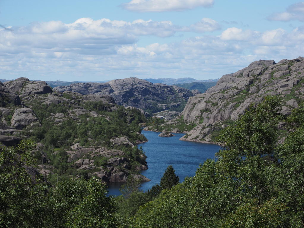
This is the Livatnet in Rogaland. Yes, Norway. The photo is purely for sentimental value, but for this post, it was as good as any other. The reason for this article was a query from ‘Olyknipser’ on oly-e, who wanted to know how the ‘Dramatic Tone’ feature works, as it produces different effects on photos taken with different cameras. In some cases, it would muddy things up and make them look washed out, and this would be particularly pronounced if you’d already been tinkering with the file beforehand.
Let’s start with the basics. Olympus was rather proud of this dramatic effect back in the day, precisely because it couldn’t be simulated in Photoshop. I don’t know if that’s possible now – perhaps in the age of AI. In any case, a simple Photoshop action certainly won’t do the trick.
Why does the filter work, and what does it do?
Broadly speaking, several things.
Blurred areas get “smudged”. Especially when I have very heavily blurred areas, it looks anything but good. Where does the smudging come from? The contrast enhancement causes subtle colour gradients to disappear, and instead of gradients between different colour tones, you end up with light/dark gradients. And it’s precisely in the blurred areas that you have exactly those kinds of gradients.

First, the original, and here it is with Dramatic Tone

Here you can see very clearly that there are tipping points in the filter that cause the colour to shift towards black. Conversely, there are equally dark areas that are significantly lightened. So it is not the case that there is a specific brightness level at which a tone ‘tips’. It even depends on where the sharpness plane lies as to whether a point shifts towards dark or light. On top of that, a particular point will shift differently depending on the colour of the neighbouring pixels and whether or not there is a contrast edge in the vicinity. There’s quite a lot of maths involved, because the neighbourhood analysis is carried out for every point in the image. So it’s not simply a matter of calculating 20 million pixels; instead, hundreds of millions of values are integrated first, and only then is the final value calculated for each pixel. If you look at how sluggishly Workspace performs this calculation and how quickly the camera does it, you can roughly gauge either just how much of a bottleneck Windows is, or just how powerful the ARM processors in the camera are running under Linux.
The issue with the tipping points is particularly ‘hair-raising’ when it comes to skin tones.

That’s the soft-focus effect. And now, Dramatic Tone

Of course, it’s impossible to compare the skin tones, because the soft-focus effect alters the colours. But what you do see is a dramatic increase in micro-contrast. The creases in the dress are sharply defined, the dents in the cardboard backing become glaringly obvious, and dirt and fluff really stand out. This effect is particularly amusing when photographing monochrome subjects with a short focal length and a closed aperture. That’s when the dirt on the sensor becomes all too obvious.
And: whilst you don’t get true skin tones, the face at least remains recognisable if you shine enough light on it. Conversely, the face may be brightened if it’s too dark.
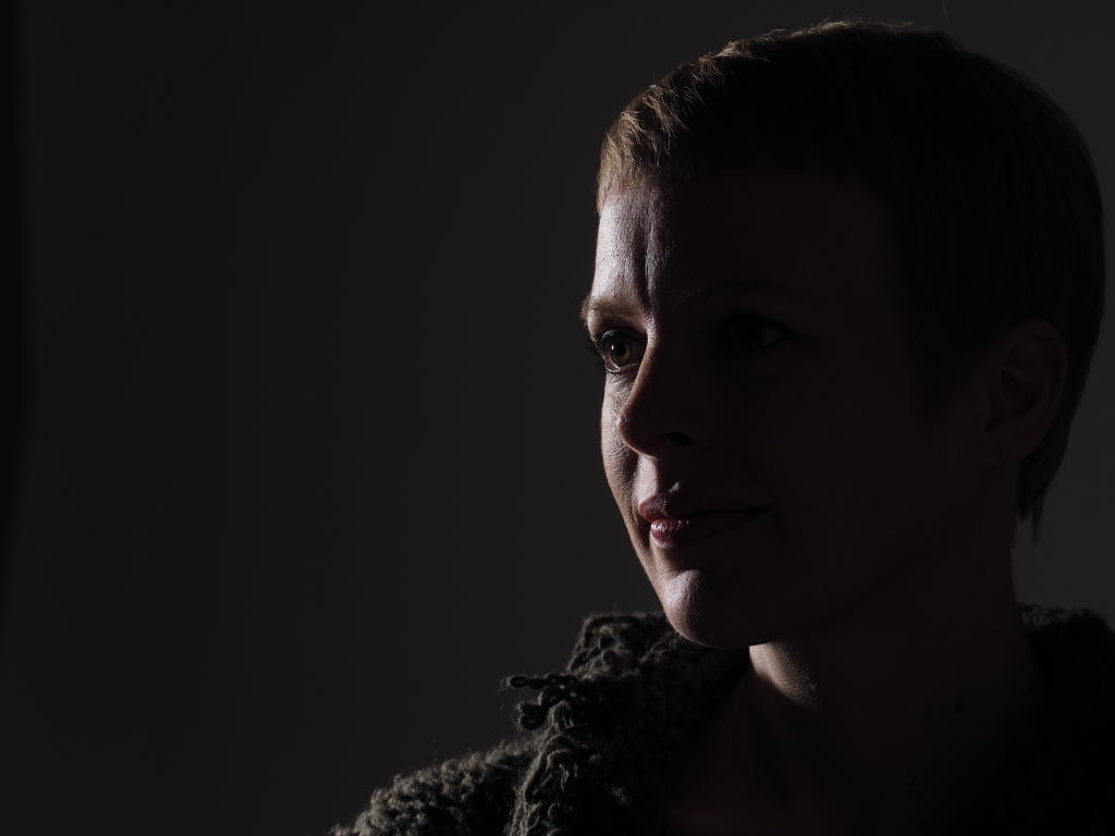
And Bazonga:

Unpredictable results? Not really. You just need to get a feel for when the effect becomes a bit eerie, when you can make use of it, and when those tipping points become a problem. An underexposed image might become brighter, whilst a normally exposed image might become darker. So if you can see on the screen that the subject is becoming too dark, increasing the exposure usually doesn’t help. The filters can be a bit odd at times. If you think the ‘Vintage’ filter is too bright, there’s no point in reducing the exposure, because the filter will compensate for it.
So what prompted this article? A user applied the ArtFilter to a FUJI JPEG and was surprised to find that it reacted differently. Here’s a series of three edits of the image from Norway to illustrate this.
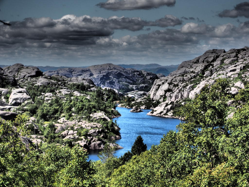
This is what the image looks like when it’s processed directly by ORF; this is the result you get straight from the camera.
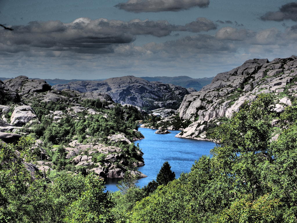
This is the result when Dramatic Tone is applied to the JPG: there are suddenly tonal breaks, particularly in the sky. The lake no longer glows, the forest looks dull and the contrast in the clouds has diminished. This is because only 8-bit data is available for the Dramatic Tone effect, rather than the 12-bit data from the RAW file. The filter has considerably less scope and the inflection points shift.
And now an image generated from the JPG after the EXIF data has been removed.
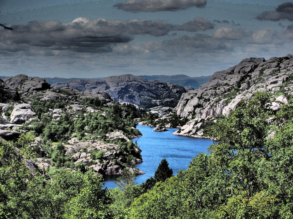
It looks quite different, particularly in the top-left corner of the sky. The reason: when the EXIF data was removed, the JPEG compression was also altered. The filter is extremely sensitive to this. So, if you’re comparing JPEGs from different cameras and how Workspace processes them, make sure they all use the same JPEG compression. And of course, when editing JPGs with a filter, make sure the image has been edited as little as possible beforehand – any editing reduces the data quality – and that the compression is as low as possible.
I used to think that during editing, the filter would analyse the JPG’s metadata – but no, it doesn’t.